




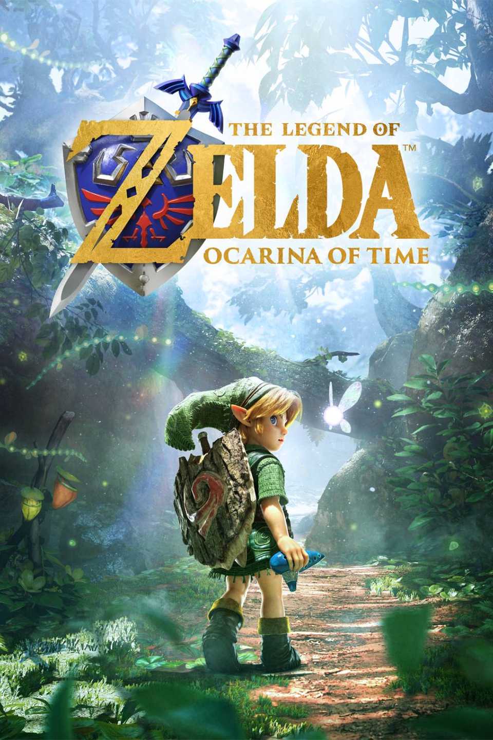
I was pretty much sold on The Legend of Zelda: Ocarina of Time remake’s art style the moment Nintendo showed it during the 40th Anniversary Zelda Direct on September 8. After Breath of the Wild and Tears of the Kingdom, I was ready to see the series try something different, and Nintendo certainly delivered. I was genuinely wowed by how alive Hyrule looked without losing the strange charm I remembered from 1998. Apparently, though, not everyone walked away from that reveal feeling the same way.
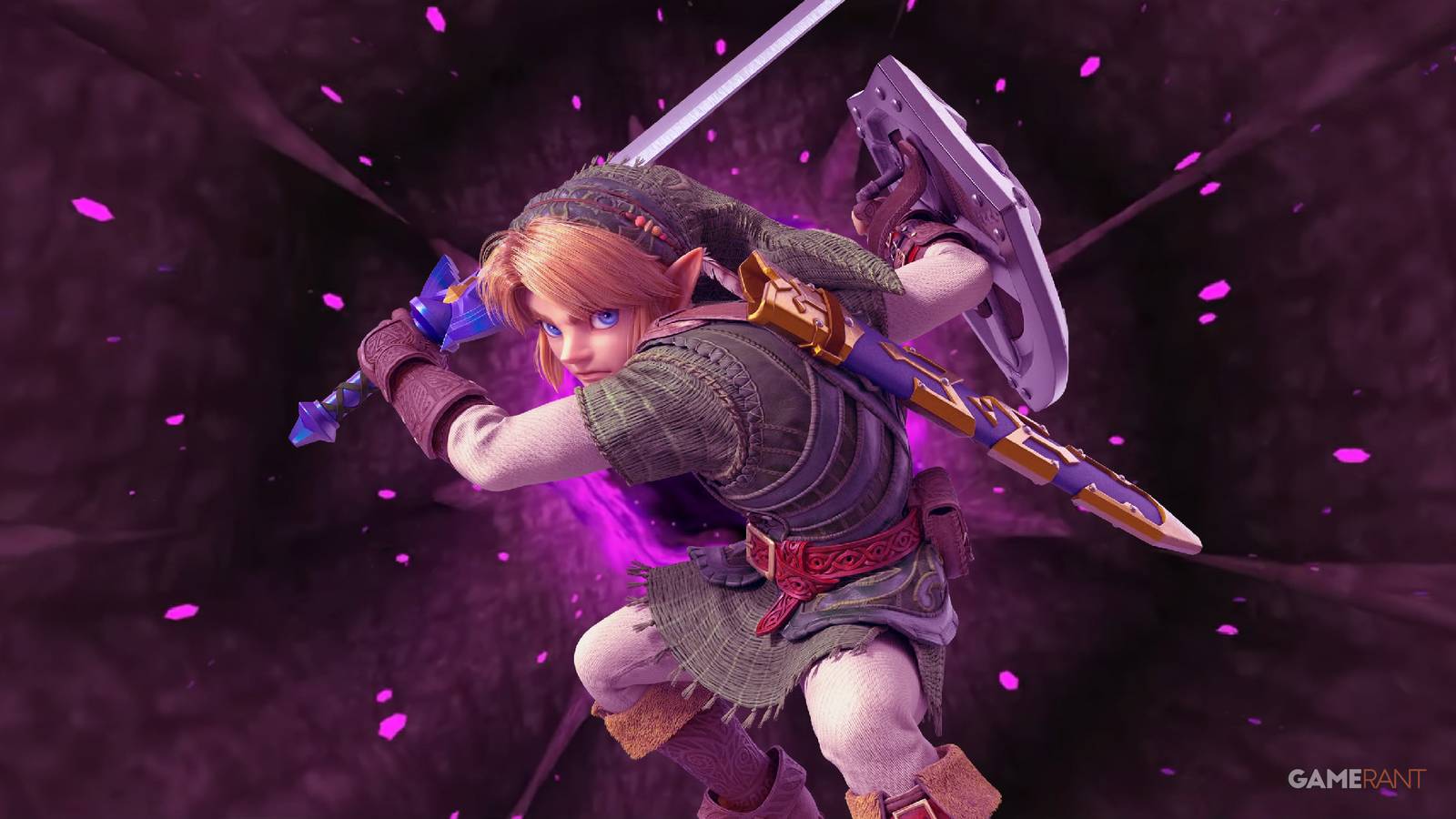
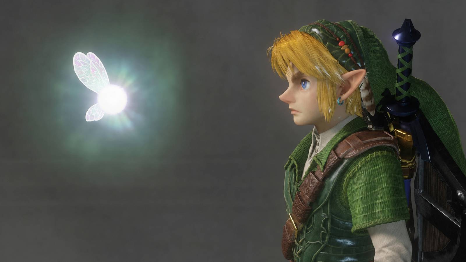
The remake’s visuals have been surprisingly divisive, with some players praising the detail while others have compared its glossy character models to Unreal Engine fan projects. Young Link has received particular criticism for looking too realistic despite his exaggerated features, and I can understand why that combination might take some getting used to. But I also think Ocarina of Time needed to look different from the open-air Zelda games we’ve been playing for almost a decade, especially considering how different its world and atmosphere are. And after reading Nintendo’s latest developer interview, I’m even more convinced that the team made the right decision.
Zelda: Ocarina of Time Remake’s Art Style Was Carefully Built Around the Original
In Nintendo’s latest Ask the Developer interview, art director Aya Shida explained that creating a richly detailed, believable Hyrule was a natural starting point, but simply making everything more realistic was never the goal. Its world has always had a darker atmosphere than its often colorful, eccentric inhabitants would suggest, and Nintendo wanted to preserve that contrast rather than make everything fit a single visual style. Shida said the team looked to puppet shows and practical-effects films for inspiration, hoping to make the characters feel at home in that world. An early 3D model of the Great Deku Tree, complete with carefully adjusted lighting and textures, helped establish that direction.


Put the consoles in the correct order.
What impressed me most about what was said in the interview, however, was the work that apparently went into something as ordinary as Young Link’s clothing. Shida explained that his tunic couldn’t look like perfectly manufactured fabric because it was supposed to be something the Kokiri children could plausibly make themselves. So the artists studied materials in museums and even experimented with weaving fabric from thread to understand what those clothes should look like. I doubt many players would notice that kind of detail without being told, but it says quite a bit about the remake’s priorities. The goal wasn’t just to give Link a more detailed outfit, but to make it feel like an outfit that belonged to someone who actually lived in Kokiri Forest.
The same care went into the NPCs, many of whom have become instantly recognizable over the years. Director HokWai Ng said the team revisited the original to study why each character was where they were and how they behaved, then rebuilt them individually rather than taking a more uniform approach. Producer Hidemaro Fujibayashi also pointed out that the N64’s limitations forced designers to exaggerate certain features and movements, something that could look unsettling if reproduced too literally with today’s technology. That helps explain why these familiar characters look different, and why I wouldn’t judge the entire art style by a screenshot of Young Link.
Art director Aya Shida explained that creating a richly detailed, believable Hyrule was a natural starting point, but simply making everything more realistic was never the goal.
Nintendo was just as deliberate when it came to Hyrule itself. According to Shida, the team gave explorable areas more visual detail than distant scenery and enlarged landmarks like Hyrule Castle and the Kakariko Village windmill so that the landscape would still communicate where players could actually go. That matters because Ocarina of Time isn’t Breath of the Wild, where seeing a mountain in the distance usually means you can eventually climb it, and the developers have deliberately preserved the original game’s separate areas rather than turning Hyrule into one seamless map. Even the level of detail in the background, then, was chosen with the original experience in mind.
Ocarina of Time Remake’s New Look Makes More Sense the Closer You Look
None of that means everyone has to suddenly love the remake’s art style, of course, and I don’t think the criticism of Young Link’s appearance is necessarily unreasonable. But there’s a difference between disliking the direction Nintendo chose and assuming it didn’t put enough thought into that choice. After years of Breath of the Wild and Tears of the Kingdom‘s more painterly approach, I was glad to see Nintendo give Ocarina of Time something distinctly its own, particularly when its tone calls for a completely different atmosphere. The developers weren’t merely trying to make a 1998 game look expensive.
I’m particularly looking forward to seeing all the little details that probably went unnoticed during the Direct, especially once I can explore the remake at my own pace on November 5. Knowing how much research went into something as small as the fabric on Link’s tunic makes me appreciate what I saw even more. For a game I’ve returned to so many times, I don’t need Nintendo to recreate exactly what I remember seeing on an N64 screen, nor do I want it to resemble Breath of the Wild all over again. I want to recognize Hyrule while feeling like I’m seeing it for the first time again, and from everything Nintendo has shown and explained, I think this art style gives the remake a real chance to accomplish that.


- Released
-
November 5, 2026
- ESRB
-
Everyone 10+ / Animated Blood, Fantasy Violence
- Developer(s)
-
Nintendo
- Publisher(s)
-
Nintendo