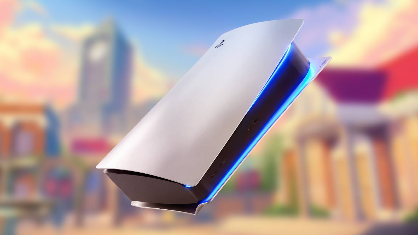









Some PlayStation fans are taking to social media to voice their displeasure with the colors Sony chose for its new Prism Collection of accessories. The negative reactions are largely focused on two upcoming PS5 controller designs whose official names do not necessarily match the colors some fans are seeing.
Sony officially announced the Prism Collection on October 28, revealing three transparent DualSense controllers and matching PS5 console covers in Flare Orange, Emerald Green, and Graphite Gray. The new designs are intended to revive the see-through electronics aesthetic strongly associated with the late 1990s, as reflected in the controllers’ glossy transparent shells and metallic center covers.
PlayStation Fans Think Sony’s Prism Colors Have the Wrong Names
Main Complaint: Flare Orange Is Not Orange
The biggest source of confusion appears to be how closely some of the official color names match what fans see in Sony’s promotional material. Social media reactions to the Prism Collection announcement have repeatedly questioned the naming, with one Redditor neatly summarizing the two most common complaints: “the orange is red and the gray is blue.” The reactions do not necessarily amount to criticism of the designs themselves, although some negative responses have surfaced as well. Nonetheless, plenty of PlayStation fans who questioned the official names have responded positively to the upcoming accessory lineup’s three colors.


Guess the games from the emojis.
Complicating the debate over the Prism Collection DualSense controllers is the collection’s transparent construction, which means the colors do not appear as uniform, flat shades across each accessory. Different portions of the shell can appear lighter, darker, or slightly different in hue depending on how much material overlaps and, as with any colored surface, how the product is lit. That makes the naming dispute less straightforward than it might initially seem, particularly since Sony says some of these color shifts are deliberate aspects of the designs.
There’s a Reason the Prism Collection Colors Don’t Look Straightforward
Sony Already Anticipated the Hue Shifts
Sony’s own explanation of the Prism Collection suggests that at least some of these apparent discrepancies are intentional. Satoshi Aoyagi from the company’s Color, Material, and Finish design division said the creators deliberately picked an orange that develops a “rosy hue” where its transparent material overlaps. Sony likewise described Graphite Gray as a cool-toned storm gray rather than a neutral gray, while characterizing Emerald Green as a deep shade of hunter green that gains additional depth through its transparency. In other words, two of the qualities prompting complaints, Flare Orange leaning toward red and Graphite Gray leaning toward blue, are broadly consistent with the effects Sony says it deliberately incorporated into the collection.
The upcoming DualSense models are priced at $84.99, while the matching console covers cost $74.99. Pre-orders are scheduled to open November 10, ahead of the Prism Collection’s official release on February 4, 2027. Based on how the company’s special-edition accessory launches have unfolded throughout the PS5 generation, there is a realistic possibility that the upcoming controllers will not remain in stock for long after release. Pre-orders may be less susceptible to immediate sellouts, as Sony has not described the Prism Collection gamepads as limited-quantity products, unlike many of its explicitly limited-edition DualSense controller launches.